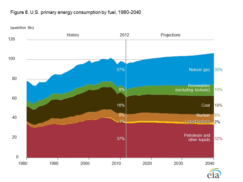
Listening to a debate about climate change, I realised I did not really know how much consumption of different energy sources has changed over timed in the US. The chart below, which is based on data from the Energy Information Administration (EIA), shows the percentage distribution of US energy consumption by source from 1950-2014. I was surprised to see just how small a fraction of the total renewables continue to represent. Rounded to the nearest percentage point, for example, solar amounted to 0% of US energy consumption in 2014. And according to the EIA, these figures are not expected to change drastically over the next few decades.

For comparison, here are similar charts for Germany, France and the UK, which I found at the blog Energy Matters. And here are pie charts for China, Russia and India, detailing recent energy consumption. As of 2012, incidentally, China, Russia, India and the US account for almost exactly half (49%) of global energy consumption.
No comments:
Post a Comment